The D.C. Policy Center report “Access to schools that level the playing field for D.C.’s at-risk students” examines where in the city at-risk students have the shortest commutes to schools that boast the very highest growth for at-risk students, or leveler schools. Out of 24 neighborhood clusters with higher concentrations of at-risk students, we find that ten lack easy commutes to leveler elementary schools and eight lack easy access to leveler middle schools. Download the report as a PDF here.
Test scores have improved for D.C. students in recent years, even taking into account demographic shifts in the city’s public school students.[1] However, achievement gaps persist by race and ethnicity, special education and English learner needs, and at-risk status.
Access to high-quality schools—schools with strong academic outcomes and the student support systems necessary to deliver these outcomes—is especially important for students who have been classified as at-risk for academic failure based on low household income or adverse life experiences. Yet, at-risk students are less likely to attend a high-quality school than other students.[2] In the 2017-18 school year, 16 percent of at-risk students attended a school with a STAR school quality rating of 4 or 5 (out of 5) on the DC School Report Card. In contrast, 48 percent of not at-risk students attended a school with a 4 or 5 STAR rating.[3]
In order to close the achievement gap, achievement levels for at-risk students must rise faster than those of their not at-risk peers, making it especially important for schools to show growth on state assessments for at-risk students. Some elementary and middle schools are doing exceptionally well at improving scores for at-risk students. These schools called leveler schools in this report (see Box 1, below).

Box 1. What is a leveler school?
This analysis defines leveler schools as schools that level the playing field for at-risk students. Instead of looking at a school’s overall STAR school quality rating, this report focuses on growth in test scores for at-risk students as its metric. Improvement in test scores for at-risk students shows the extent to which students are catching up to their peers, thus closing the achievement gap. This analysis identifies elementary and middles schools* as leveler schools if they meet their at-risk growth target on the state report card. That target is set high at the 90th percentile of improvement in scores for at-risk students in either English Language Arts (ELA) or Math. Growth in test scores is measured by the Media Growth Percentile (MGP), the typical growth for individual students compared to academically similar students in the previous year.
This report focuses on growth in test scores for at-risk students for three reasons:
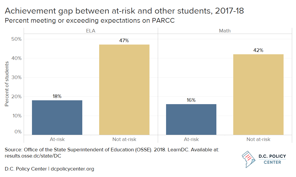
- In D.C., the achievement gap between at-risk and non-at-risk students is large (29 percentage points in ELA and 26 percentage points in Math in the 2017-18 school year). At-risk status can be used as a proxy for higher levels of academic need.
- At-risk students are a major subgroup in D.C., comprising almost half of all public school students.
- Schools receive additional funding from D.C. for their at-risk students, which provides a policy lever to improve their achievement.
*Growth metrics are not available for high schools in D.C.
However, leveler schools are not always located in the neighborhood clusters where the most at-risk students live. This means that many at-risk students would face particularly long commutes to attend these leveler schools that would likely serve them best (see Box 2, below). Even if students can travel to leveler schools, there is not enough space at their facilities to serve all at-risk students, and in some cases, waitlists can be prohibitively long.
To get a sense of the extent to which at-risk students can access the schools that best serve them, this analysis compares the duration of typical commutes to school to locations of leveler school, and highlights commutes by public transit or walking.

Box 2. Typical commutes to school in D.C.
To get a sense of the extent to which at-risk students can access the schools that best serve them, this analysis compares the duration of typical commutes to school to locations of leveler school, and highlights commutes by public transit or walking.
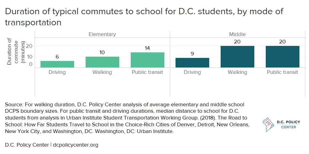
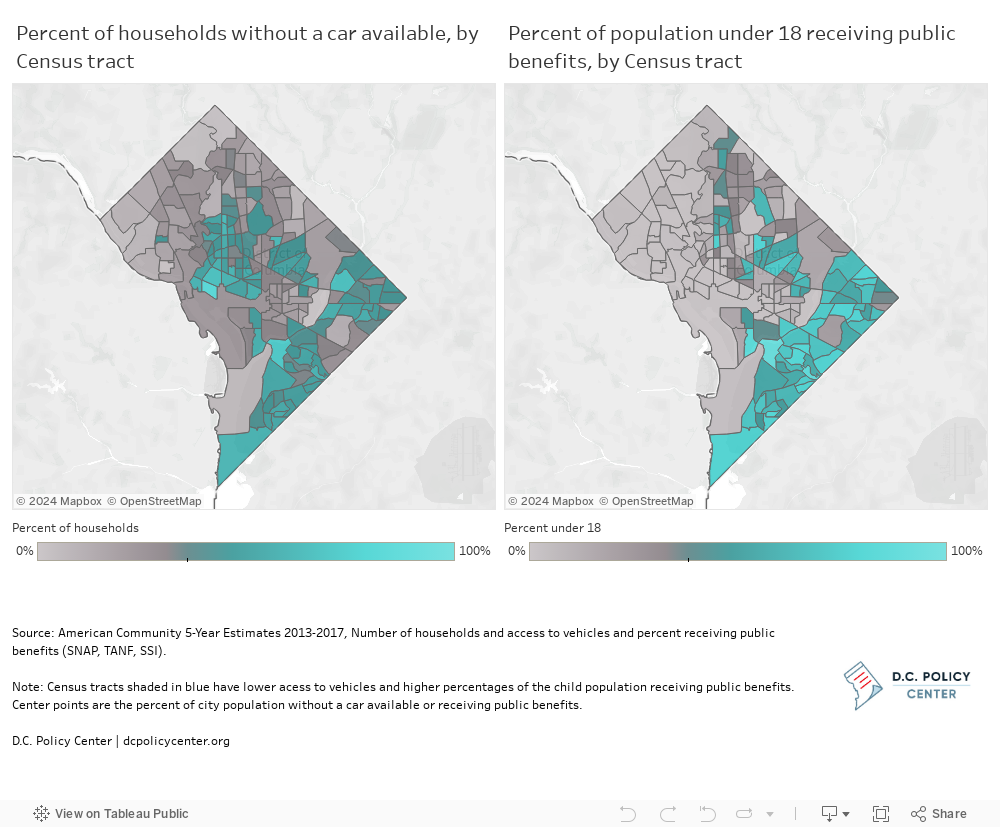
While the largest share (43 percent) of public school students travel to school by car according to a survey conducted in 2017 by the Center for Reinventing Public Education, Census data estimate that 46 percent of D.C. households do not have a vehicle available. Given that there is an overlap between areas of the District with low car ownership rates and those with high percentages of the child population receiving public benefits (and therefore likely to be at-risk), transit and walking are more likely than other modes to be the way at-risk students get to school.
Typical commutes for elementary and middle schools are estimated using the average school boundary sizes for walking distance (10 minutes for elementary and 20 minutes for middle), median distance by public transit (14 minutes for elementary and 20 minutes for middle in total commute time) as well as by car (6 minutes for elementary and 9 minutes for middle) for all students in the relevant grade band according to an Urban Institute report, The Road to School.
Some D.C. neighborhood clusters[4] both have higher than average concentrations of at-risk students and lack easy geographic access to leveler schools (see Figure 1). Most of these neighborhood clusters are east of the Anacostia River.
Figure 1. Neighborhood clusters with higher needs for leveler elementary and middle schools
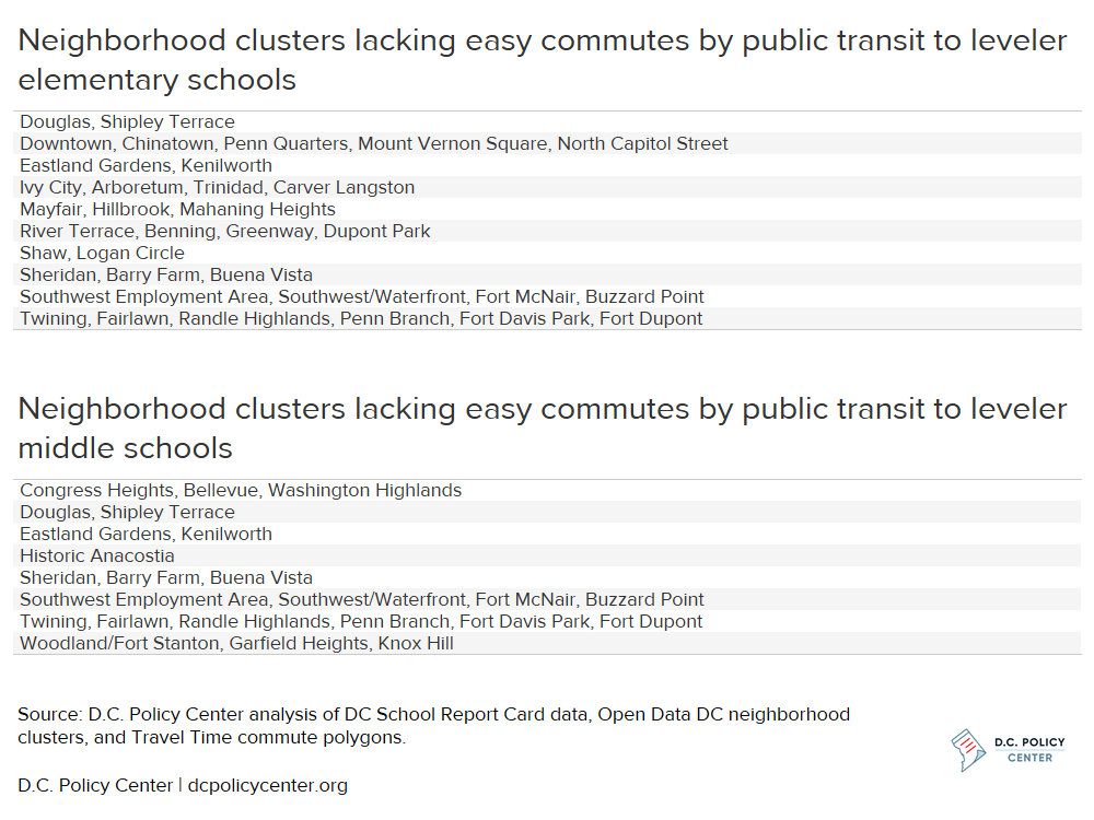
In these neighborhoods, schools currently serving the neighborhood’s at-risk students may need additional supports. The District should also monitor growth outcomes for at-risk students to identify additional schools that do better than average in closing the achievement gap for at-risk students – some neighborhoods have schools like Bunker Hill Elementary that showed promising increases in student scores in 2017-18, but just missed the threshold for being a leveler school. The city should also think about how to improve public transit options to make it easier for at-risk students living in these neighborhoods to attend the schools that could serve them best.
Background: D.C.’s At-risk students
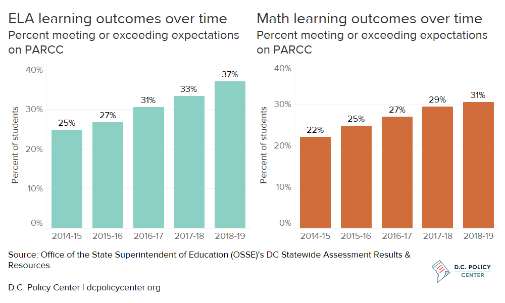
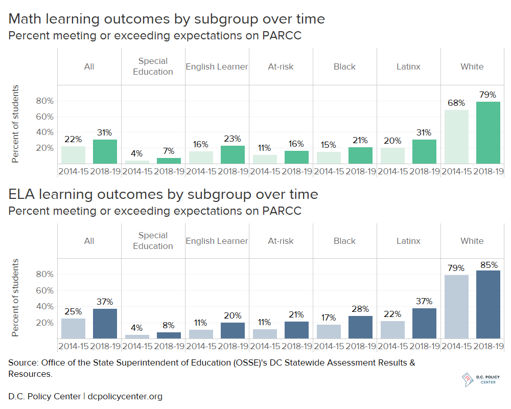
Learning outcomes have improved for students in the District of Columbia for 11 consecutive years: the first seven years under D.C.’s previous state assessment,[5] and since school year 2014-15 under the current state assessment (see Figure 2),[6] where the percent of students who meet or exceed expectations has increased by eight percentage points in Math, and 12 percentage points in English Language Arts (ELA) over the past four years. Nonetheless, learning outcomes remain low: In school year 2018-19,[7] just 37 percent of students met or exceeded expectations in ELA and 31 percent of students met or exceeded expectations in Math.
Figure 2. Learning outcomes for D.C.’s public school students have been increasing over time
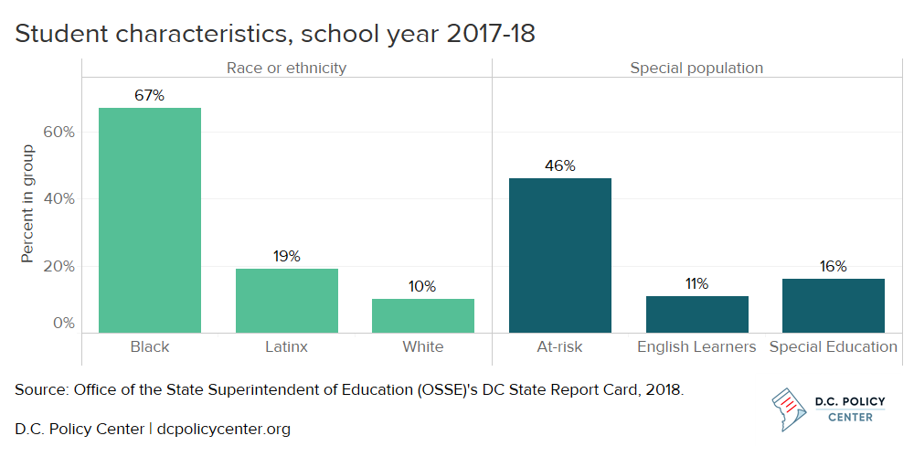
D.C.’s public school students represent three primary races and ethnicities, and three main special populations (see Figure 3). In 2017-18, most students (67 percent) in D.C. were Black, followed by 19 percent of students who were Latinx, 10 percent of students who were white, and four percent of students of other race or ethnicities. Almost half of students were at-risk for academic failure.[8] Since 2014-15, the District of Columbia has provided about $2,000 in supplemental funding per student who is at-risk,[9] which includes students who receive Temporary Assistance to Needy Families (TANF) or Supplemental Nutrition Assistance Program (SNAP) benefits, experience homelessness, are a part of the foster care system, or are over-age in high school. Other special populations include D.C.’s Special Education students at 16 percent of the student population (higher than the national average of 14 percent[10]), and the 11 percent of students who were English Learners.
Figure 3. Almost of half of D.C.’s public school students are at-risk
Large achievement gaps remain between white students, the group with the most students meeting or exceeding expectations on the state assessment, and other subgroups in both ELA and Math (see Figure 4). Special Education students have the largest achievement gaps, followed by at-risk students and English Learners.
Figure 4. Achievement gaps remain by subgroup, especially for special populations
There is also a wide achievement gap between students who are at-risk and those who are not at-risk. The gap in the percent meeting or exceeding expectations between at-risk students and other students was 29 percentage points in ELA and 26 percentage points in Math in school year 2017-18 (see Figure 5) – on average, one in every six at-risk students met or exceeded expectations in ELA or Math, and one in every two not at-risk students did so.
Figure 5. Achievement gaps are large between at-risk and not at-risk students in D.C.
This gap in achievement is expected to persist given recent trends: one analysis shows that D.C.’s at-risk students will not perform at the same level as their higher-income peers for another 34 years.[11] From 2014-15 to 2018-19, the percentage of students meeting or exceeding expectations by subgroups aside from Latinx students did not increase by as much as the overall increase for all students. At-risk students improved by five percentage points in Math and 10 percentage points in ELA, compared to citywide gains of eight and 12 percentage points, respectively. Though some schools are performing better than would be expected, at-risk students are not catching up to higher achieving peers, making it especially critical to identify opportunities for at-risk students to make large gains in achievement.
Schools and homes of at-risk students
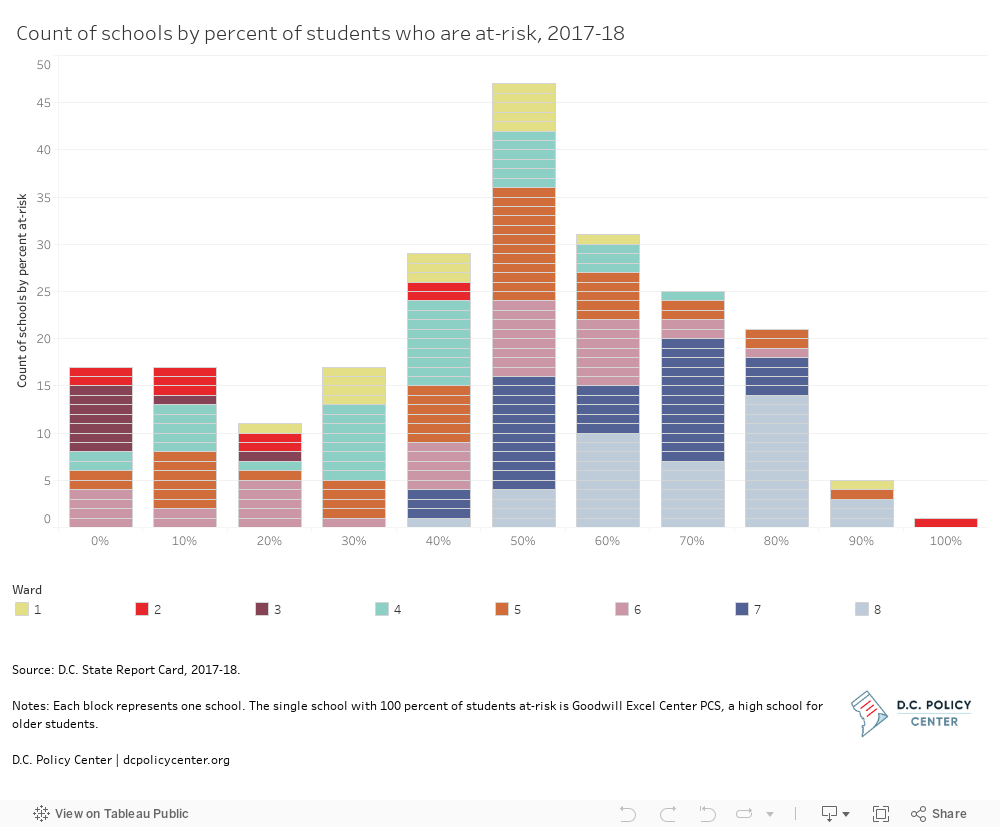
D.C.’s student body is less segregated by economic status than by race and ethnicity,[12] although it is still very segregated along both measures: The median school has a student body that is 55 percent at-risk; a third of schools have student populations between 40 and 60 percent at-risk (see Figure 6). This means that it is very common for schools to serve a high share of at-risk students, unlike other subgroups – particularly English Learner and Special Education students – who have different levels of academic need.
There is also a subset of 17 schools with a very low share of at-risk students (less than 10 percent of students who are at-risk). Fewer schools—just six—have more than 90 percent of students who are at-risk.
Figure 6. At many schools, around half of students are at-risk
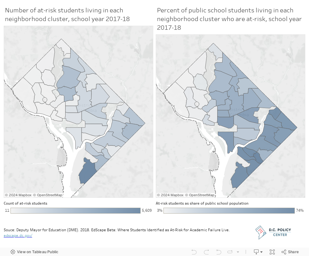
Very large numbers of at-risk students live in high concentrations of some neighborhoods of the city (see Figure 7). In 2017-18, at least 5,000 at-risk students lived in the neighborhood cluster of Congress Heights, Bellevue, and Washington Highlands, which accounts for 14 percent of all at-risk students in D.C. public schools (compared to 10 percent of all public school enrollment). The Douglas, Capitol View, Columbia Heights, Brightwood Park, and Deanwood neighborhood clusters all had more than 2,000 at-risk students living within their borders. In 14 out of 39 neighborhood clusters, over half of public school students are at-risk.
Figure 7. At-risk students, by where they live, levels and shares
Patterns in transportation to school for at-risk students
D.C. has a high degree of public school choice, with just 27 percent of public school students attending their in-boundary DCPS school.[13] About 47 percent of students left their home ward to attend school in 2017-18.[14] In general, students travel shorter distances to reach elementary school grades than do older students (see Figure 8). An Urban Institute report, “The Road to School: How Far Students Travel to School in the Choice-Rich Cities of Denver, Detroit, New Orleans, New York City, and Washington, DC”,[15] found that the median elementary school student lives a six-minute drive from school or a 14-minute trip using public transit (irrespective of the actual mode of transportation chosen). By comparison, middle school students tend to live a median distance of nine minutes from school by car or 20 minutes on public transit. District of Columbia Public Schools (DCPS) boundary sizes provide a reference point for a reasonable walking distance for elementary and middle school students. Given the average boundary size, elementary school students attending their in-boundary DCPS school would be expected to walk about half a mile to reach their school and middle school students would be expected to walk about a mile.[16]
Figure 8. Typical commutes to school are longer for middle school students
Living in a household without a car can also constrain commutes to leveler schools. A survey conducted in 2017 by the Center for Reinventing Public Education found that among D.C.’s students who attend public schools, the largest share (43 percent) travel to school by car, following by walking (23 percent) or public transit (22 percent).[17] Although driving is the primary mode for commutes to school, 46 percent of D.C.’s households do not have a vehicle available to their household. The area east of the Anacostia River tends to have lower levels of car ownership (see Figure 9) coupled with lower median incomes[18] and a higher percentage of the population under 18 receiving public benefits (and therefore likely to be designated at-risk).
Figure 9. Large shares of households do not have a car available in some areas of D.C., especially in some pockets where large percentages of the child population receive public benefits
At-risk students can benefit most from schools that have high growth in learning outcomes
Access to high-quality schools—schools with strong academic outcomes, and student support systems necessary to deliver these outcomes—is especially important for at-risk students, as achievement levels for at-risk students must rise faster than those of their peers in order for both groups to have the same outcomes. Despite this need, at-risk students are less likely to attend a high-quality school as identified by a STAR rating of 4 or 5 on the DC School Report Card.[19] In 2017-18, 16 percent of at-risk students attended a school with a rating of 4 or 5 compared to 48 percent of not at-risk students.[20]
Instead of an overall measure of school quality, growth on state assessments is particularly critical for at-risk students as their scores are lower than those of their not at-risk peers.[21] Growth can be measured by median growth percentile (MGP), which is determined as the typical growth for individual students as compared to academically similar students.[22] Growth for at-risk students is one strong method of identifying which schools are best catching their at-risk students up to their not at-risk peers, and are thus contributing the most to closing the achievement gap. This analysis identifies these leveler schools[23] if they meet the target on the state report card (set high at the 90th percentile) of growth in either ELA or Math.[24]
Leveler elementary schools
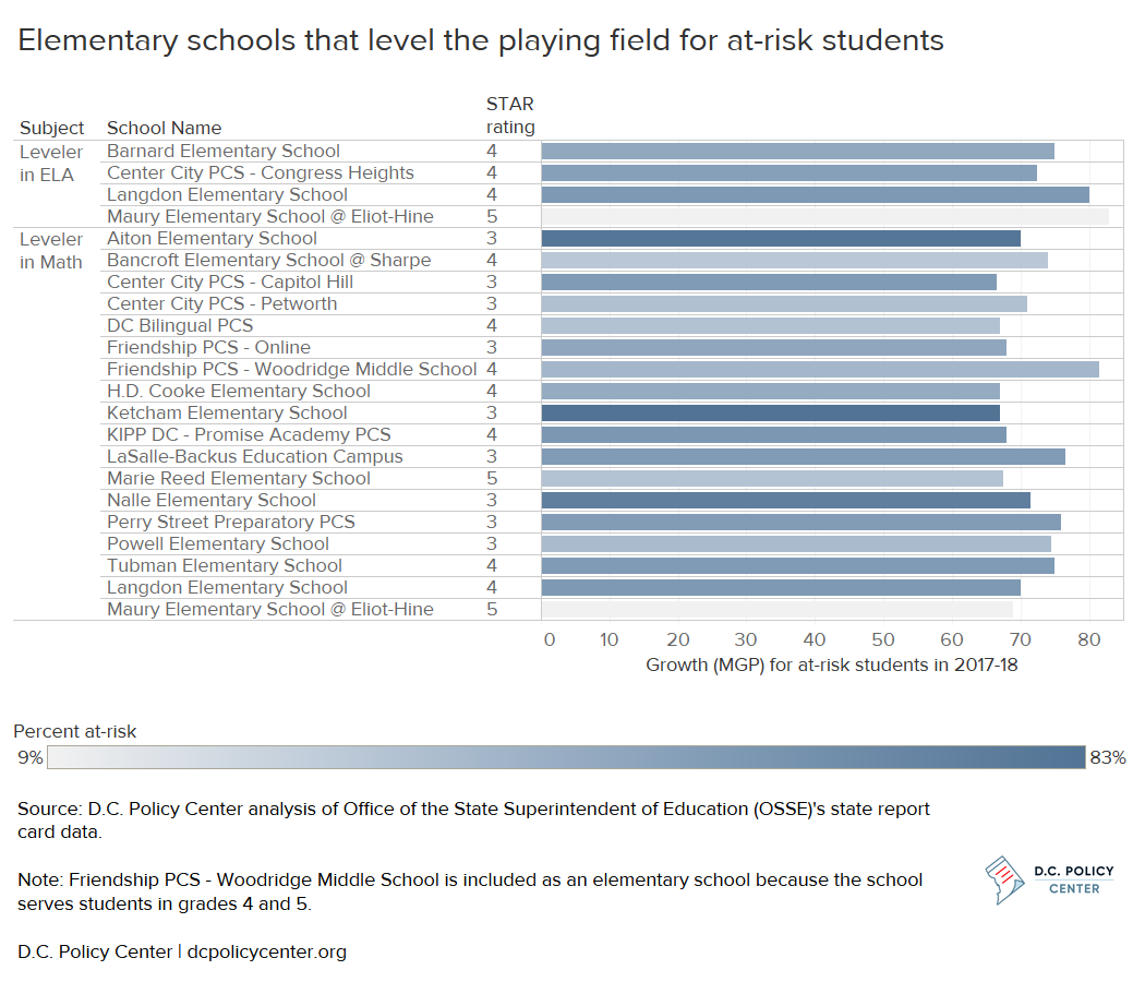
In elementary grades, 20 schools out of 122 with PARCC growth data had the highest growth for at-risk students and met the report card target of 69 for MGP in ELA or 66 for MGP in Math (two schools met targets in both subjects, see Figure 10). This means that at-risk students at these schools experienced more growth in their PARCC score than 69 percent of peers in ELA or 66 percent of peers in Math who had similar scores the previous year. These schools are located in all wards aside from wards 2 and 3, and they serve student populations who are between 9 percent and 83 percent at-risk (50 percent on average compared to a citywide figure of 47 percent).
Figure 10. Leveler elementary schools
Leveler middle schools
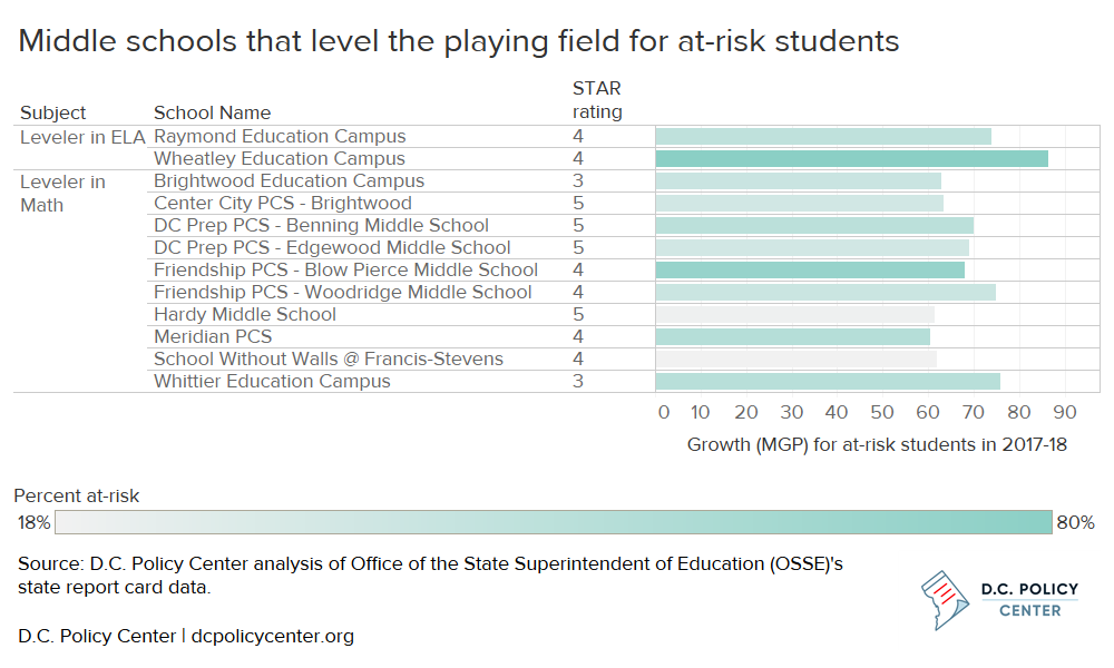
In middle grades, 12 out of the 72 schools with PARCC growth data do the most to catch up at-risk students, meeting the targets of 71 in ELA and 60 in Math (see Figure 11). This means that at-risk students at these schools had better growth in their PARCC score than 71 percent of peers in ELA or 60 percent of peers in Math who had similar scores the previous year. These schools are located in all wards aside from wards 3 and 6, and they serve students who are between 18 percent and 80 percent at risk (45 percent on average, compared to a citywide figure of 47 percent).
Figure 11. Leveler middle schools
Findings: Geographic access to leveler schools
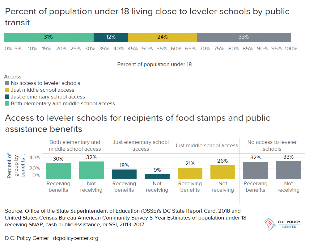
Looking to the location of leveler schools and how long it takes students to commute to these schools, about a third of the population under 18 lives within a typical commute on public transit (14 minutes for elementary school students, and 20 minutes for middle school students) to a leveler elementary and a leveler middle school (see Figure 12). Another third of the child population lives farther than a typical commute to these leveler schools. The remaining third is closer to either a leveler elementary or a leveler middle school. The population with access to middle schools only is broader than elementary-only – possibly because commutes to middle school grades are longer on average. Using children who receive benefits of food stamps and public assistance (including Supplemental Security Income, or SSI) as a proxy, since the majority of at-risk students receive food stamps,[25] at-risk students are likely to have similar levels of geographic access to leveler schools. They have relatively more access to elementary schools, but access fades a bit in middle school.
Figure 12. About a third of the child population lives far from leveler schools
While it is a critical factor influencing school choice,[26] geographic proximity is not the only measure of access to schools. At some schools, waitlists for a seat at a public charter or out-of-boundary school can be prohibitively high, making it less likely for student to have a reasonable chance to get a space through D.C.’s common lottery. Looking at waitlists for these 32 leveler schools, the length of the average waitlists across all grades is 211 students (similar to average waitlists across all schools).[27] About 25 percent of students on waitlists receive offers by October at these leveler schools in addition to those matching in the first round of the lottery (similar to the rates for all schools), and 14 of the leveler schools have more open access with waitlists fewer than 60 students. Another constraint is capacity: There aren’t enough spaces for all at-risk students: These leveler schools serve about 12,500 students (approximately 5,800 of whom are at-risk), far fewer than the estimated 32,000 elementary and middle school at-risk students.[28]
Commutes to leveler elementary schools
If all at-risk elementary school students had access to a car, students living in most of the city could reach leveler elementary schools within a six-minute drive (the median travel time to school by car for elementary school students – see Figure 13). However, easy geographic access to school decreases for students who take public transit (a commute of under 14 minutes on public transit) or walk (within 10 minutes’ walking distance). This means that there are large areas of the city where students (particularly those who are at-risk) must travel farther than their peers in other parts of the city to reach the schools that best serve them.
Figure 13. Commutes by public transit and walking limit access to leveler elementary schools
Commutes to leveler elementary schools by car
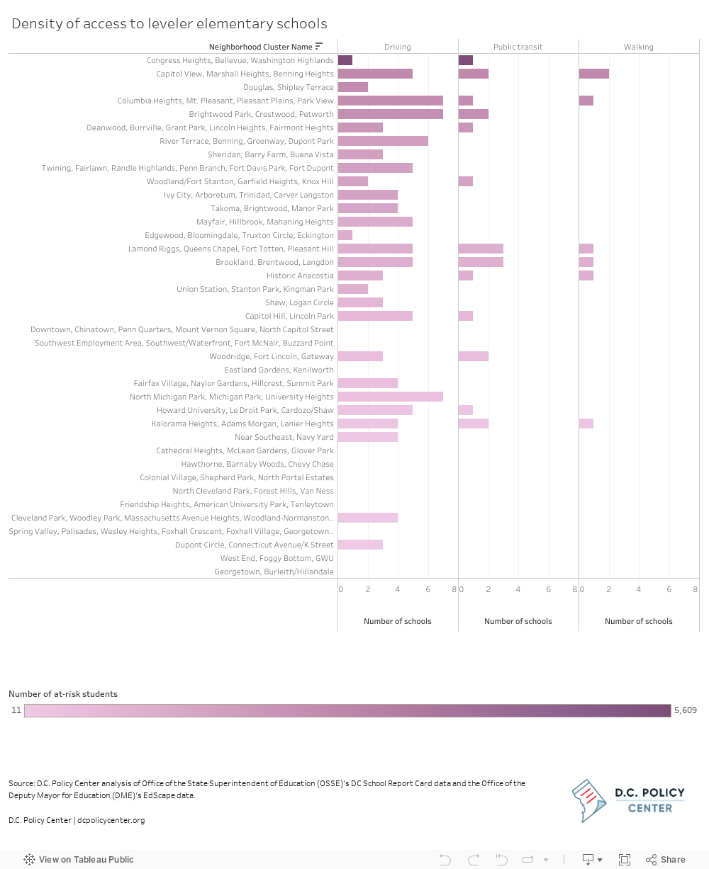
Density of access, or the number of leveler elementary schools within a typical commute, varies by neighborhood cluster (see Figure 14).[29] For public transit and walking commutes to schools, the Lamond Riggs and Brookland clusters have the highest number of leveler elementary schools nearby, but they are middle of the pack in terms of the number of at-risk students who live in these clusters. The Congress Heights cluster, by comparison, has the most at-risk students (in all grades) but easy geographic access to only one leveler school by public transit.
Figure 14. Access to more leveler elementary schools without a car is low for some clusters with many at-risk students
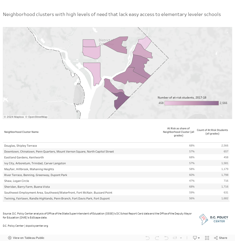
There are 10 neighborhoods with high percentages of students who are at-risk[30] where most students don’t live within easy access to any of the leveler elementary schools[31] by public transit or walking (see Figure 15). The majority of these neighborhoods are located east of the Anacostia River. Many of these neighborhoods have more than 1,000 at-risk students (in all grades), more than the average across neighborhood clusters, in addition to a higher than average percentage of at-risk students.
Figure 15. Neighborhood clusters without access to leveler elementary schools, many are east of the Anacostia River
Commutes to leveler middle schools
Although there are fewer leveler middle schools, students living in a larger area of the city have access to them, given longer median commute times to middle school grades (see Figure 16). If all at-risk students could be driven to school, they could access schools in most of the city aside from the most southern point. However, the leveler middle schools are concentrated in the northern half of D.C., meaning that access to leveler middle schools becomes curtailed if students are commuting on public transit or on foot for 20 minutes.
Figure 16. Commutes by public transit and walking limit access to leveler middle schools to the northern half of the city
Commutes to leveler middle schools by car
Commutes to leveler middle schools by public transit
Commutes to leveler middle schools on foot
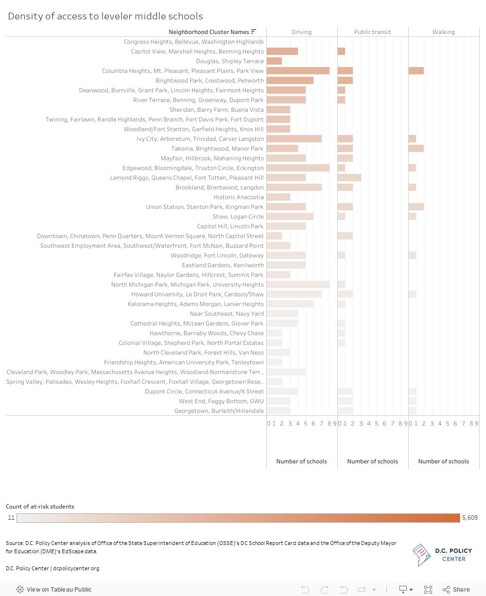
Middle school students living in all but one neighborhood cluster (Congress Heights, Bellevue, Washington Highlands, which is the neighborhood cluster with the highest number of at-risk students) could have a typical commute to a leveler middle school if they had access to a car (see Figure 17). However, this number dwindles to 24 out of 39 neighborhood clusters if students only have access to public transit, and 12 out of 39 neighborhood clusters if students are walking to school.
Figure 17. Access to leveler middle schools is limited in many clusters
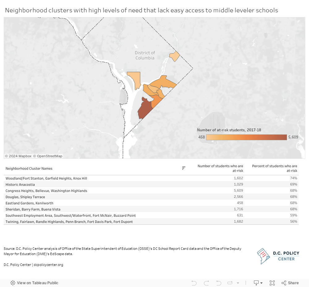
There are eight neighborhood clusters with high percentages of at-risk students and in which most students don’t live within easy geographic access to the city’s 12 leveler middle schools (see Figure 18). All but one of these eight neighborhood clusters are located in the southern part of the city. The Congress Heights neighborhood cluster stands out as the cluster with the highest number of at-risk students but no nearby leveler middle school.
Figure 18. Neighborhood clusters lacking easy access to leveler middle schools
Takeaways
Learning outcomes are improving in the District, but large gaps remain by subgroup, especially for at-risk students. High growth from year to year in learning outcomes is particularly critical to catch these at-risk students up to their higher-income peers and level the playing field.
Key Findings:
- There are 20 leveler elementary schools and 12 leveler middle schools that meet the high targets for growth for their at-risk students on the DC School Report Card.
- If all students in the city had access to a car, most at-risk students could reach these schools within the length of a typical commute. However, car ownership is lower in some areas of the city that overlap with in some cases with lower levels of household income.
- Geographic proximity is not the only factor that limits access. Capacity at leveler schools is lower than the estimated need, and waitlists at participating schools can be prohibitively long (although waitlists and offers at leveler schools are similar to the school system as a whole). Additionally, some schools may only offer a limited number of seats in the lottery, especially for out-of-boundary students or students in non-entry grades.
- Even if there were enough capacity, access to these leveler schools becomes limited if students are traveling by public transit or walking given typical commutes to school in D.C. Out of 24 neighborhood clusters with higher concentrations of at-risk students, ten lack easy access to leveler elementary schools and eight lack easy access to leveler middle schools.
Next steps:
- In the neighborhoods that currently lack easy access to leveler schools, schools serving at-risk students may need additional supports to help accelerate academic gains. For example, EmpowerK12’s Bold Improvement schools enlist three key strategies to boost learning for at-risk students: using data and information in frequent and intentional ways; increasing collaboration within the classroom and school as well as across schools; and ensuring students are ready to learn by setting high expectations and creating a warm socio-emotional environment.
- D.C. needs to increase availability of schools that best serve at-risk students. This could mean monitoring growth outcomes for at-risk students at other schools, as some neighborhoods have schools like Bunker Hill ES that fell just below the target last year. The city should also think about how to improve public transit options so that it is easier for at-risk students living in these neighborhood clusters to attend the schools that serve them best.
About the data
The education data in this analysis are from the Office of the State Superintendent of Education (OSSE)’s D.C. School Report Card and the Office of the Deputy Mayor for Education’s EdScape. Throughout this analysis, the term “public schools” is used to refer to both traditional public schools and public charter schools.
The population data in this analysis are from the United States Census Bureau and American Community Survey 5-Year Estimates.
Neighborhood Cluster shapefiles are from Open Data DC.
More information about the methodology and direct links to the underlying data can be found at https://data.dcpolicycenter.org/posts/level-playing-field/.
Acknowledgements
The author is grateful to Education Forward DC and the Walton Family Foundation for their generous support of the Education Policy Initiative. This research was guided by members of the Education Policy Initiative Advisory Board, which includes Matt Chingos, Steven Glazerman, Savannah Gress, Sara Mead, and Jon Valant. At the D.C. Policy Center, Yesim Sayin Taylor and Kathryn Zickuhr offered crucial guidance. Simone Roy provided valuable research assistance.
Chelsea Coffin is the Director of the Education Policy Initiative at the D.C. Policy Center.
The views expressed in this paper are those of the author and should not be attributed to members of the D.C. Policy Center’s Board of Directors or its funders. The research, analysis, and policy recommendations published by the D.C. Policy Center staff and independent experts are not determined by the D.C. Policy Center’s Board of Directors or its funders.
Feature photo of Diana Schneider from the U.S. Department of Education shadowing teacher Flora Lerenman at H.D. Cooke Elementary in Washington D.C. as part of the Department’s ED Goes Back to School Events courtesy of the U.S. Department of Education (Source).
